About Diamond Jubilee Logo:
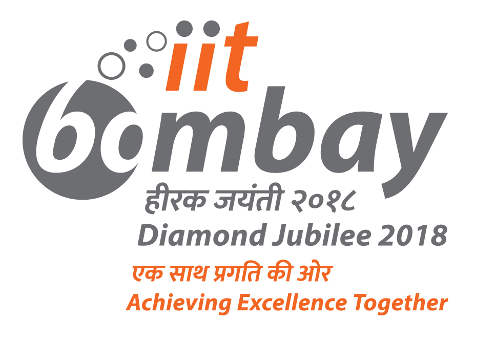
- To represent the epitome of knowledge and to exude a sense of sophistication, a very subtle and effective perceptual shift ambigram is used for the Diamond Jubilee Celebrations logo. The characters in the circle indicates '60' while the consolidated word interprets ‘bombay’. Though the second letter ‘o’ is incomplete, closure occurs and viewers' perception completes the shape, making it memorable.
- The circular element at the begining and the “emerging circles” indicate technological advancement and gives an impression of celebration.
- Colour orange is used to represent sunshine, creativity, determination while grey is used to represent sophistication.
- Putting practical use of the understandings acquired at the university is reflected through the tagline ‘Achieving Excellence Together’.
The logo is designed by Mr Shashidhar Reddy, alumnus of Industrial Design Centre, IIT Bombay and the tag line 'Achieving Excellence Together' is by Mr. Vikrant Raj, alumnus of the Department of Chemical Engineering, IIT Bombay.
Please note the following when using the logos:
- Always use both the logos
The Diamond Jubilee logo should be on the top left corner and the Institute logo on the top right corner of the page.
- Colour composition:
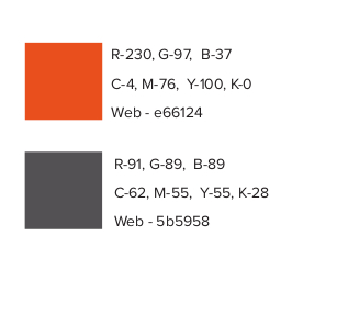
For Diamond Jubilee Logo: Follow the colour composition given in the file below:
Orange: R-230, G-97, B-37 | C-4, M-76, Y-100, K-0 | Web - e66124
Grey : R-91, G-89, B-89 | C-62, M-55, Y-55, K-28 | Web - 5b5958
For download:
- IIT Bombay Logo in .JPG Format
- IIT Bombay Logo in .PNG Format
- IIT Bombay Logo in .PDF Format
- IIT Bombay Logo in .EPS Format
- IIT Bombay Diamond Jubilee Logo in .JPG Format
- IIT Bombay Diamond Jubilee Logo in . PNG Format
- IIT Bombay Diamond Jubilee Logo in .PDF Format
- IIT Bombay Diamond Jubilee Logo in .EPS Format
- Colour composition for Diamond Jubilee Logo